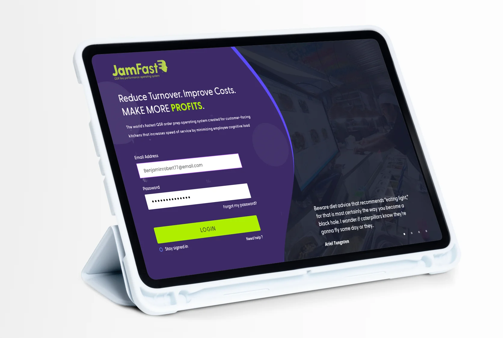
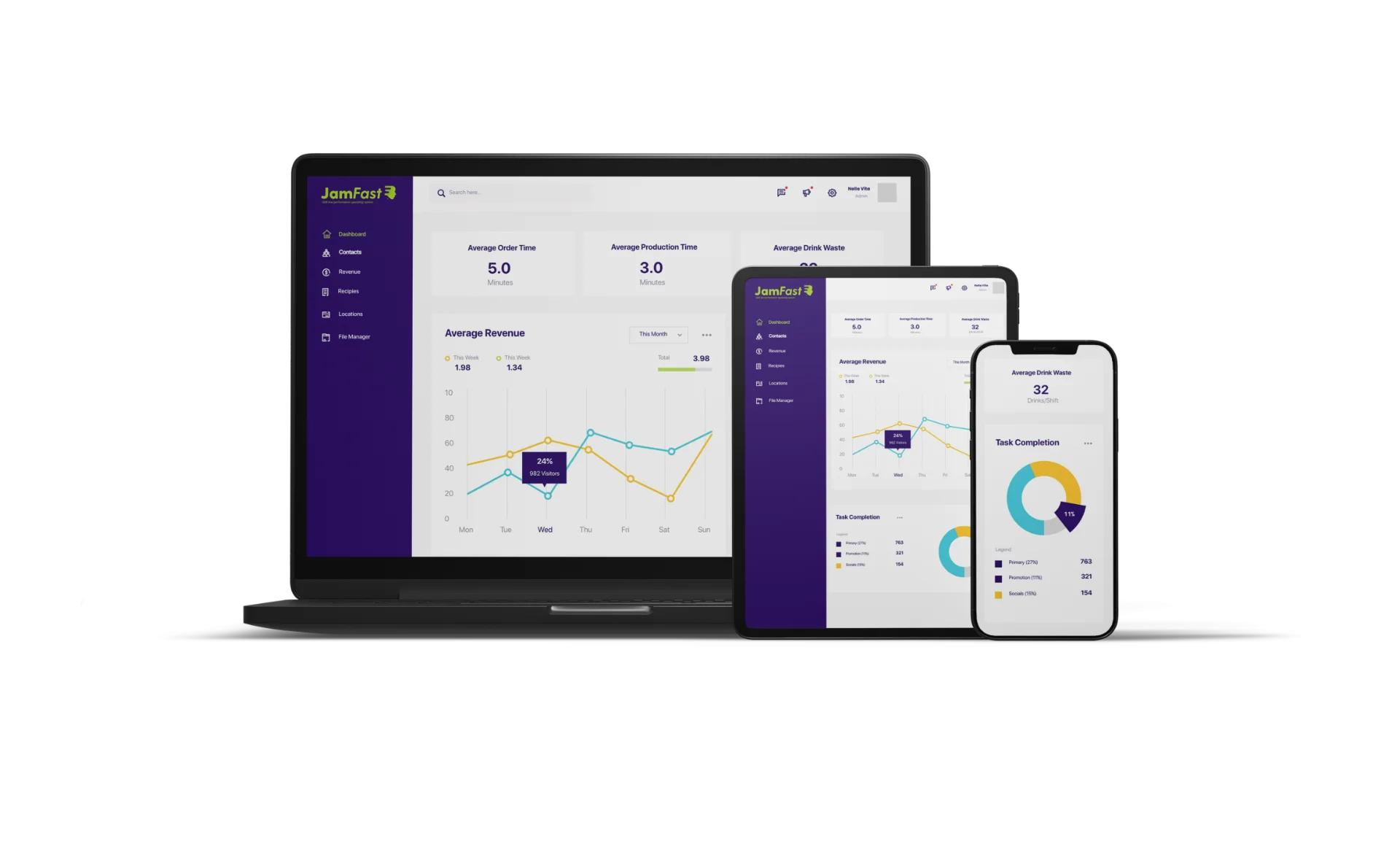
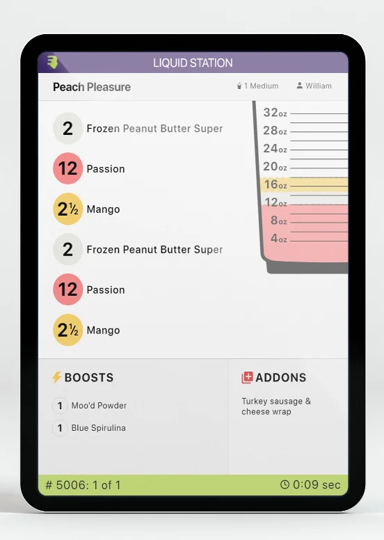
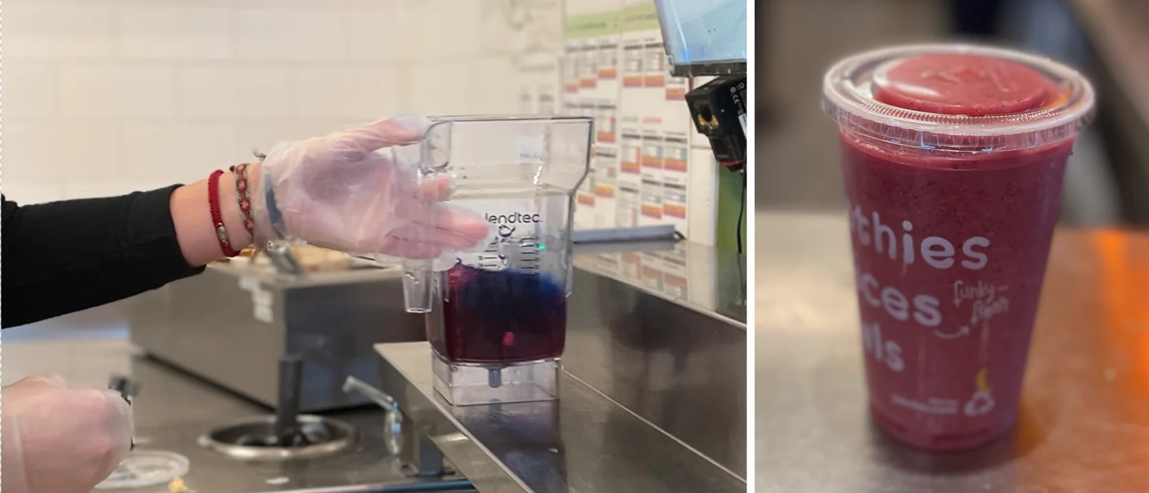
We designed an interface that made complexity feel simple.

JamFast approached us with a sophisticated challenge wrapped in a deceptively simple premise: make line performance automation feel intuitive, even effortless. Their technology was powerful—capable of streamlining operations, boosting team morale, and improving efficiency across multiple locations. But power without polish is just potential. They needed an interface that made complexity invisible.

The stakes were high. This wasn’t just another app. It was a tool that employees would use daily, managers would rely on hourly, and franchisees would judge instantly. The experience had to be flawless.

Industry

Sports Marketing Agency


Location

London, UK

The challenge

Line performance automation sounds technical because it is. Behind JamFast’s functionality lies intricate data processing, real-time performance tracking, recipe management, and multi-location coordination. The challenge wasn’t just designing screens—it was translating complexity into clarity.

Their existing interface worked, but it didn’t flow. New employees faced steep learning curves. Managers spent too much time navigating rather than managing. The app didn’t feel intuitive, and in fast-paced service environments, every second of confusion costs money and morale.

The brief was clear: redesign the entire app experience from the ground up. Make it faster to learn, easier to use, and delightful enough that teams would actually want to engage with it.

Our approach

We began where all great UX begins—with users. Through research and discovery sessions, we mapped the daily reality of line workers, shift managers, and franchisees. We identified pain points, documented workflows, and uncovered the moments where the current experience broke down.

From these insights, we reimagined the entire information architecture. We stripped away unnecessary complexity, reorganized navigation around actual user tasks, and created clear hierarchies that made the most critical actions immediately accessible.

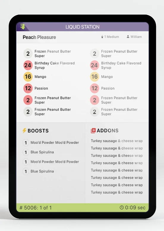
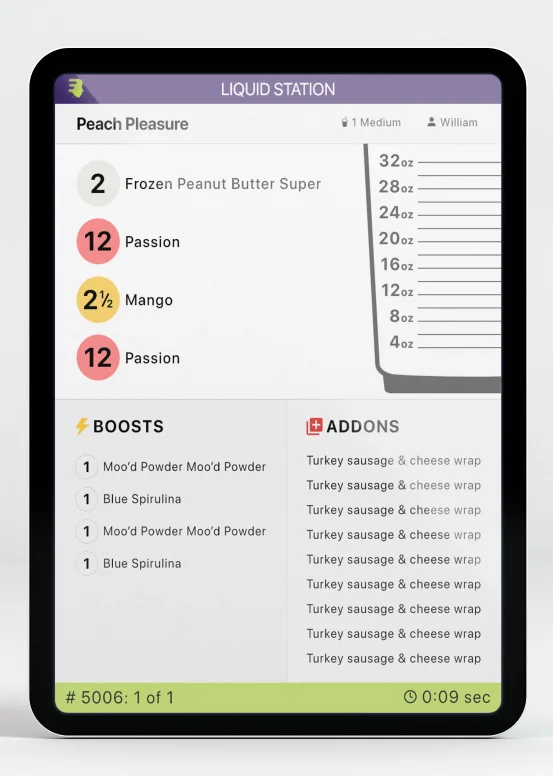
The visual design followed function. Clean interfaces with breathing room. Bold, readable typography that works in busy kitchen environments. Intuitive iconography that communicates at a glance. A color system that guides attention without overwhelming. Every element was crafted to reduce cognitive load—making the right action obvious, every time.
We obsessed over the micro-interactions. Smooth transitions that provide feedback. Smart defaults that anticipate needs. Error states that guide rather than frustrate. Loading states that feel fast even when processing complex data. These details don’t just improve usability—they build trust.

The result was a complete UI/UX redesign that transformed how people interact with JamFast. From onboarding flows that get new employees productive in minutes to dashboard designs that surface critical insights instantly—every screen was optimized for real-world performance.

The results

Today, JamFast feels as smooth as the operations it automates. New employees pick it up naturally. Managers navigate with confidence. The app doesn’t just work—it disappears, letting users focus on what matters: making great products and serving customers.

The transformation shows in the feedback: boosted morale, reduced training time, increased adoption rates. But perhaps the truest measure of great UX is invisibility—when technology works so well, users forget they’re using it at all.


That’s what we built for JamFast. An interface so intuitive, it feels like second nature.

© 2025 cogniatrium™ All rights reserved.

Design & Developed by Cogniatrium