We designed an interface that unlocks AI’s potential.
Prompt on Demand came to us with a powerful idea: democratize access to high-quality AI prompts. In a world where AI capabilities are exploding but most people struggle to get useful results, they saw an opportunity—a platform where anyone could access expertly crafted prompts for any use case, instantly.
The concept was brilliant. The interface? It needed to match that brilliance.
Sports Marketing Agency
London, UK
AI prompt platforms face a unique design challenge. The users range from complete beginners who barely understand what a prompt is, to power users who want sophisticated customization options. The content—thousands of prompts across dozens of categories—needs to be instantly browsable yet deeply searchable. And the experience must feel effortless, because the whole promise is making AI accessible.
Their existing concept felt cluttered. Navigation was confusing. Finding the right prompt required too much effort. The interface didn’t inspire confidence that this was the solution to their AI struggles. In a space moving this fast, unclear design means abandoned users.
The brief was clear: create a UI/UX that makes discovering, customizing, and using AI prompts feel intuitive—regardless of the user’s technical expertise.
We began with user research—understanding the different personas who would use Prompt on Demand. The content creator looking for social media prompts. The marketer needing campaign ideas. The developer seeking code generation templates. The student wanting study assistance. Each had different needs, different comfort levels with AI, and different expectations.
From these insights, we designed an experience built around discovery and simplicity.
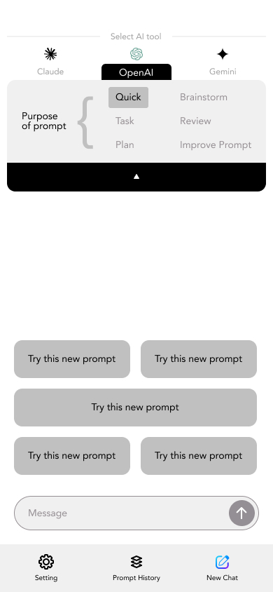
The homepage became a launchpad—immediately showing popular prompts, trending categories, and a smart search that understood natural language queries. Users could browse by use case, industry, or goal. No jargon. No confusion. Just clear pathways to what they needed.
The prompt pages themselves became showcases of clarity. Each prompt displayed with clear descriptions, example outputs, customization options, and use-case scenarios. Users could preview how prompts worked before committing. They could adjust parameters with intuitive sliders and dropdowns—no coding required.
We designed a visual language that balanced professionalism with approachability. Clean typography that made reading effortless. A color palette that felt modern without being overwhelming. Iconography that communicated function instantly. Generous whitespace that let content breathe rather than compete for attention.
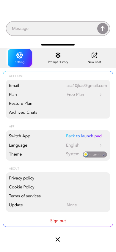
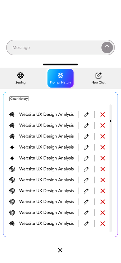
The interaction design focused on reducing friction. One-click copying of prompts. Smart favorites and history features. Collections that let users organize prompts by project. Seamless sharing options for teams. Every micro-interaction was crafted to feel smooth and satisfying—the kind of details that transform using a product from a task into a pleasure.
For power users, we built advanced features that didn’t clutter the core experience—detailed filtering, bulk actions, customization tools—accessible when needed but invisible when not.
Today, Prompt on Demand feels as intelligent as the AI it serves. New users can find and use their first prompt within seconds. Experienced users can dive deep into customization without feeling constrained. The platform doesn’t just provide prompts—it provides clarity in a space often defined by confusion.
The design speaks for itself: high engagement rates, low bounce rates, users returning frequently. But perhaps the truest measure is this—people stop thinking about the interface and start focusing on what they can create with AI.
We built an experience that makes AI accessible, not intimidating. Clear, not cluttered. Powerful, not overwhelming.
That’s what happens when design truly serves the user.